Derivan Student
What are warm & cool colours
Why are cool & warm colours important
The Colour Book (brief look) | The Colour Workbook (brief look)
Derivan Student Sets
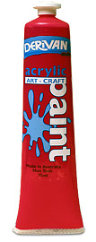
For general art education. Great for teaching colour mixing, producing strong pure secondary and tertiary colours. Smooth buttery consistency. Can be used for screen printing, block printing and painting from impasto to water-colour effects.
Derivan Student has been manufactured since 1964. As part of our commitment to producing only the best products, Derivan Student acrylic is made using a pure acrylic binder giving you the advantage of a quality acrylic paint at a student price. The full range consists of 40 colours including 25 standard colours - primaries (cool and warm), secondary and tertiary - 2 metallic, 6 glitter and 7 fluorescent colours.
All colours are available in 75ml tubes. Selected colours are also available in 250ml jars, 1 Litre and 2 Litre bottles and 2 Litre Eco-Paks (soft pouch). See Colours & Sizes page.
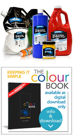
Application
Derivan Student Acrylic Paints are ideal for a wide range of art and craft applications for the beginner through to the advanced artist or crafter. Whether adding a splash of colour to your craft project, or creating your own masterpiece on canvas, Derivan Student Acrylics have the versatility for a broad range of painting techniques. Derivan Student is a fast drying, non-toxic and water-based paint with bright, opaque colours that can be used on most porous surfaces, including paper, cardboard, wood, MDF, plaster and canvas.
Acrylic Painting
Use straight from the tubes. Water is suitable for dilution or clean-up. Both gloss and water resistance are greatly improved by additions of Derivan polymer Varnish to the paint.
Poster Colour Effects
These are best obtained by mixing the paint with plenty of Derivan Student White and at the same time adjusting the sheen of the paint with MatisseMM5 Matt Medium. Alternatively the finished painting is treated with a coating of one of the Matisse Matt Varnishes available.
Watercolour Work
Just add water to the paint but mix it slowly to avoid foaming. Apply with a soft brush. Additions of Derivan Spreader Medium will improve brush control for delicate flat water colour glazes. Derivan Drying Retarder is often beneficial as it maintains water sensitivity for washes and at the same time improves flow as well as penetration into the paper.
Oil Painting Effects
Extend the paint with Derivan Impasto medium for structure and with water-based Derivan Polymer Varnish for increased gloss or desired flow-out. Apply with a knife or bristle brush.
![]()
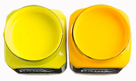
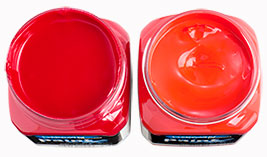
Derivan Student colours bias comparison or cool and warm comparison.
|
||
 |
 |
 |
Lemon Yellow (green bias, cool) on the left and Yellow (orange bias, warm) on the right |
Red (purple bias cool) on the left and Scarlet (orange bias, warm) on the right |
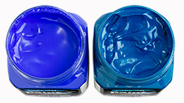
Ultra Blue (purple bias, warm) on the left and Phthalo Blue (green bias, cool) on the right |
What are Warm and Cool colours
Generally speaking, from an artistic point of view, there is no universal classification or agreed standard rating system that, with certainty, will designate colours as “warm” or “cool” within the colour spectrum wheel.
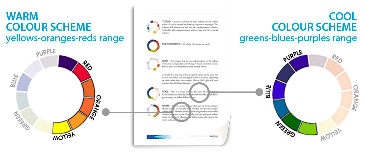
Colour temperature classification (based on the colour's mass tone) is relative but in a broad sense, it is perceived that warm colours can be found within the yellows, oranges and reds range, while the cool colours are found within the greens, blues and violets range.
But the warm and cool differences don’t really stop there. Each colour itself can actually have a warm and a cool version (based on the colour's undertone), depending upon how close it is on the colour wheel to the warm and cool designations.
 |
|
One of Derivan’s publications, THE COLOUR BOOK – Keeping It Simple, has a comprehensive but yet clear and concise explanation on colour theory. It is all about colour, its properties and relationship between the light colour spectrum, pigments and paint.
The image on the left shows that at the point of meeting, red is the warmest colour and violet is the coolest. Therefore a warm tone of yellow is closest to what is designated as the warm side of the colour wheel, where as a cool tone of yellow is closer to the cool side of the colour wheel.
In terms of colour mixing, the warm yellow will have more red in it and the cool yellow will have more of a blue undertone.
Why are Cool and Warm Colours Important?
To successfully mix colours with acrylic paint and create coordinated colour schemes it is advantageous to know the bias of a particular colour and its hidden undertone. The bias is commonly known as the colour temperature or "warm" and "cool" and the undertone is the tendency of the colour to lean towards a warmer or cooler characteristic. For example, a true blue can have a "cool" green undertone (as in Turquoise) or a "warm" violet undertone (as in Phthalo Blue).
Selecting the correct colour with the right colour bias and undertone will result in cleaner and more harmonious mixes. Bright mixed colours only contain two primaries. For example, a warm red (Derivan Student Scarlet) and a warm yellow (Derivan Student Yellow) will make a bright vivid orange - the warm red (bias) contains a bit of yellow (undertone) and the warm yellow (bias) contains a bit of red (undertone) - only two primaries are involved (there is no blue undertone anywhere here).
The use of either a cool or warm colours can create different moods on an artwork. As the name suggests, warm colours produce a sense of warmth and heat. They also are more prominent to the eye and appear to “come closer”. By contrast, cool colours recede more and have a colder, sombre feel about them. Think about what you want the viewer to feel when they see your artwork.
Although these are not defined rules, they are worth considering in relation to your subject and the emotion you want to convey. The idea is to experiment and see what works best for you.
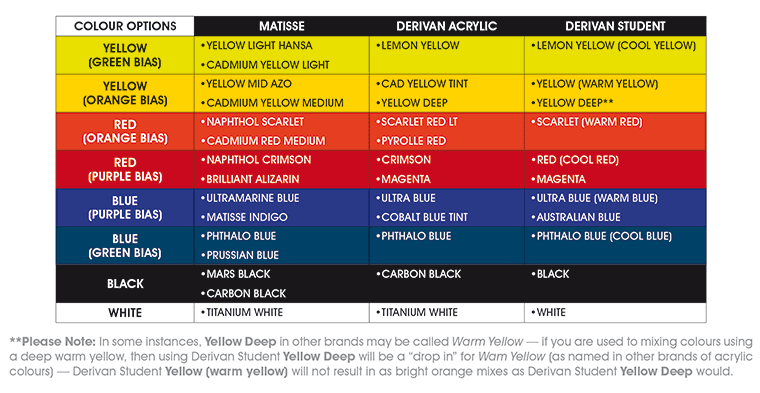
The table above is a quick reference guide to equivalent warm or cool colours in Matisse or Derivan Acrylic range of colours available. The table diagram is based on information that appears in The Colour Book publication.
![]()
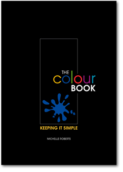
The Colour Book
Download PDF version of The Colour Book here (4.2Mb)![]()
Learn and understand colour through theory and practical exercises. An effortless but complete and clear way to become familiar with its principles and how to incorporate them into your projects. By doing the activities in this book you will improve your understanding of colour by 70%.
This book has been written using Matisse Structure and Flow Formula acrylic paints from Derivan Pty Ltd. We have chosen this brand because of their extremely high quality and brilliant colours. You will however, be able to use other ranges or brands – and you’ll find this book useful anywhere you’re thinking about colour. If you are using Derivan Acrylic, or Derivan Student ranges - please use the table on page 91 in the book as a reference for colour option equivalents.
Brief Inside Look |
||
 |
 |
 |
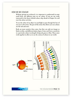
concise information on colour perception |
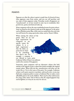
supportive art resource information |
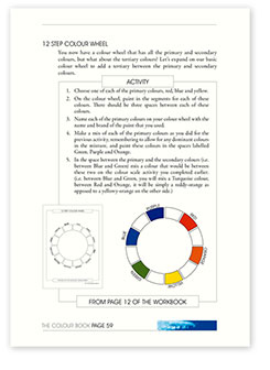
easy to follow activity pages |
The Colour Workbook
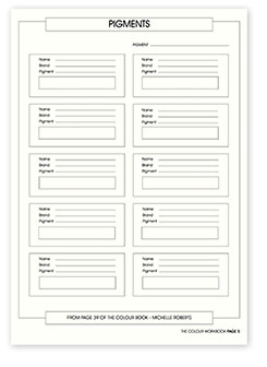
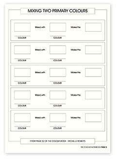
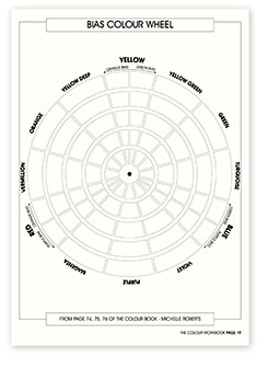
Companion publication to The Colour Book with step by step exercises and activities with diagrams and dedicated areas where you can put your learning to practice. This practical book contains black line master pages for all the activities included in The Colour Book, so you can create copies through which you can complete each of the exercises to follow in the main book.
Download PDF version of The Colour Workbook here (800Kb)![]()
Brief Inside Look |
||
 |
 |
 |
keep records of the paints you use |
create useful reference of mixed colours |
build your own bias colour wheel |
![]()
Student Sets
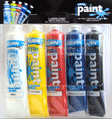
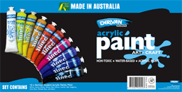
Derivan Student Acrylic Paint is available in two distinctive sets, an intro starter pack of primary colours and a pack containing a selection of cool and warm colours and tones, to allow easy identifying and learning the basics of colour mixing.
Intro Set - 5 x 75ml tubesTitanium White |
 |
Primary Set - 10 x 75ml tubes Titanium White |
 |


